Watching Wes Anderson

Watching Wes Anderson Without Watching Wes Anderson


The normal way of watching a movie involves experiencing it frame by frame, unfolding linearly over time as visual elements build upon one another. This project reimagines that approach, offering a single, comprehensive view to explore the visual essence of Wes Anderson's films.

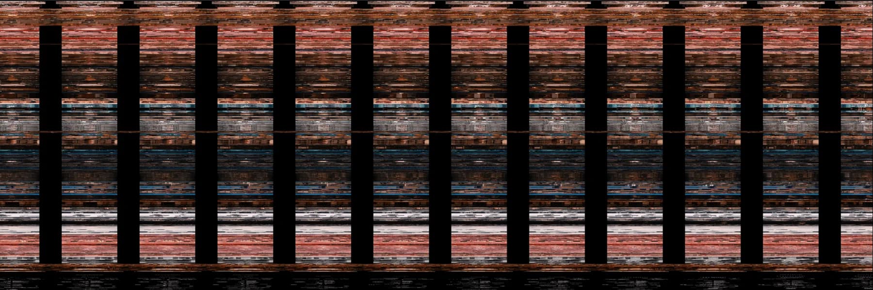
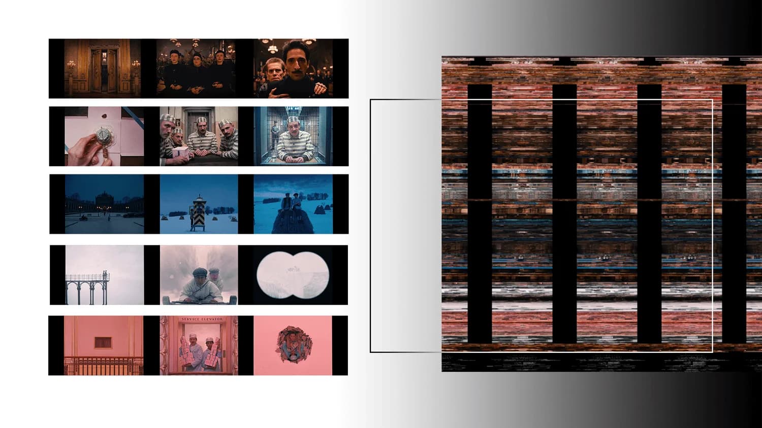
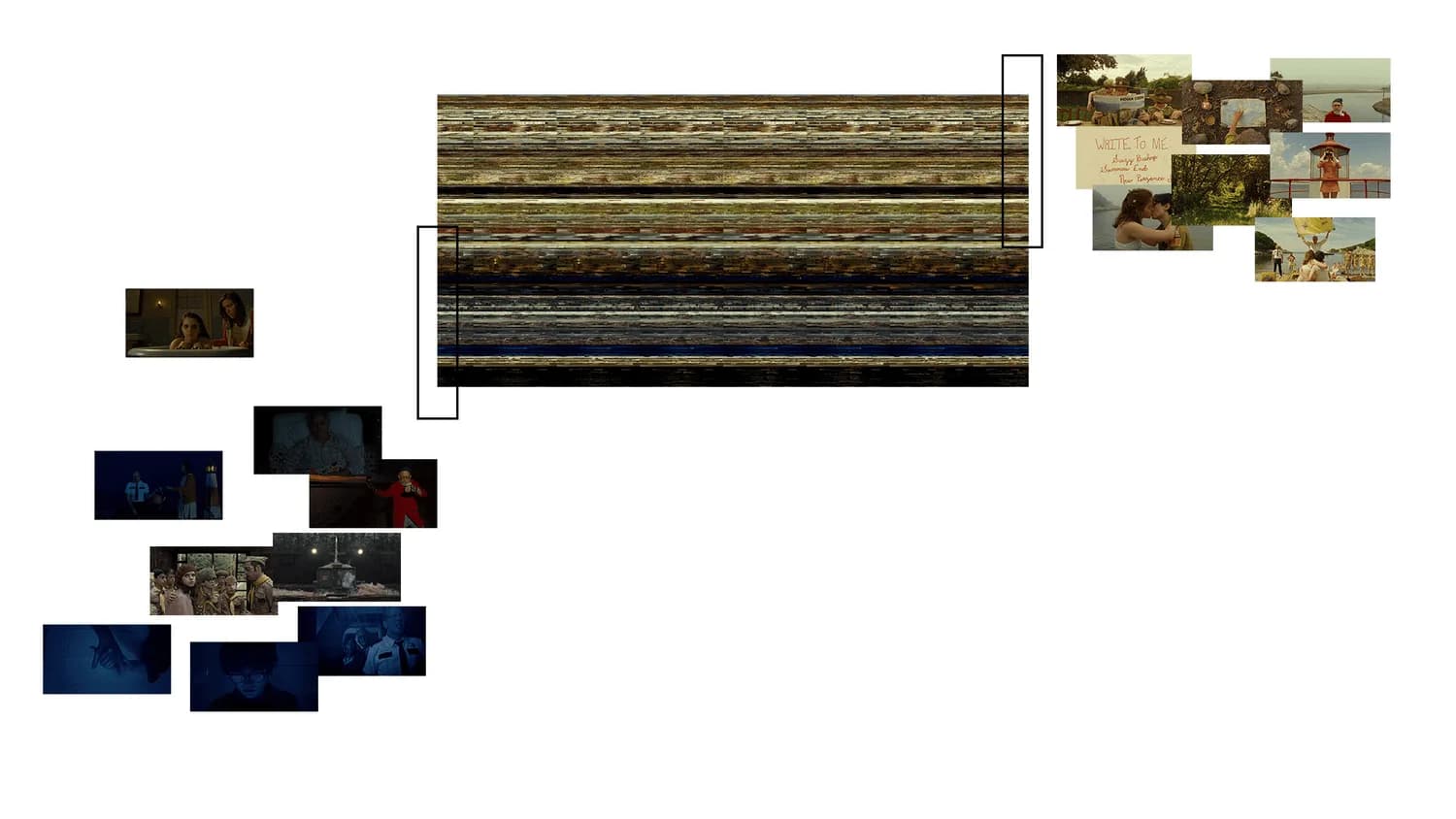
To achieve this, each frame of the film was transformed from its original rectangular shape (720x1280) into a long, compressed strip (1x921,600 pixels). These strips were then stacked vertically to create the final artwork. As a result, the movie unfolds vertically from top to bottom, representing the progression from beginning to end. Horizontally, our eyes trace a zigzag pattern, moving through individual scenes from left to right and top to bottom.


Moonrise Kingdom (2012)

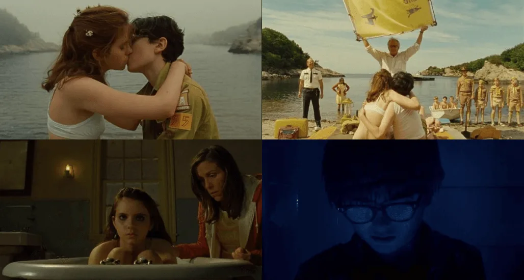
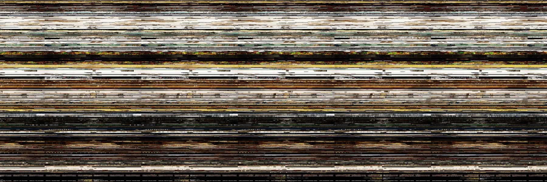
Moonrise Kingdom is divided into two distinctive palettes: before the storm and after the storm. The “before the storm” embraces the warm colors of yellow, green, and brown, with scenes mostly shot in bright sunlight while the “after the storm” rages in cooler shades of blue and teal, with lots of scenes without the sun or even in the dark.

The transition from the bright color to the darker one doesn’t follow the change of nature (the arrival of the storm) in the movie. It, however, follows the transition of the characters’ emotions. The change started right after Sam and Suzy got caught by the beach. The following scene of Suzy’s conversation with her mom immediately takes the sunlight out and drowns the movie in the cold tub. Perhaps, the movie’s real storm already raged after that conversation.


The Grand Budapest Hotel (2014)

The movie has many noticeable black columns that run vertically. Their widths vary in the beginning, then become consistent as the movie goes on. These black columns are created from the black margin of the frames. Different size of black margin signifies different screen ratios. In fact, Wes Anderson intentionally used different screen ratios to mimic different eras’ cinematic styles. The 80’s ⎯ 1.85 : 1, The 60’s ⎯ 2.40 : 1, The 30’s ⎯ 1.37:1.


The movie is clearly divided into blocks of colors. Each group of scenes is in one distinctive palette of color. The transition of color is both more extreme and playful than in his early works - Moonrise Kingdom and The Life Aquatic of Steve Zissou.

Isle of Dogs (2018)
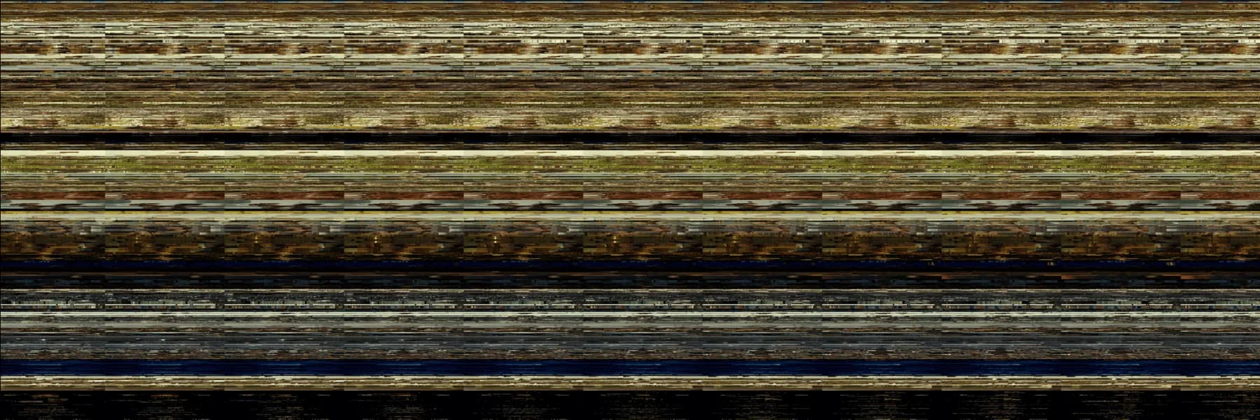
Continued with the idea of using colors to define space for characters’ emotions, Isle of Dogs used extreme colors, black and white, to depict two different groups of scenes: the trash island and the city hall. Yellow strips that run horizontally between them are Tracy Walker. She brings light to the revolution of Atari and the dogs.
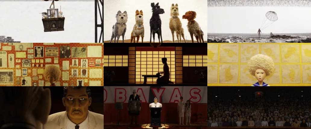
Several groups of scenes in Isle of Dogs maintain a fixed layout, with both characters and the camera making minimal moves. For example, in the white strip area in the middle, we can see that the black area (the characters) stays in place for several continuous scenes. This can be the effect of stop motion, where continuous scenes have very subtle changes, so the audiences can really focus on such change and the “stop-motion delay” between the change. For example, the making sushi scene.

However, when considering other movies by Wes Anderson, The Grand Budapest Hotel also has this same pattern. Many scenes in the movie, especially scenes where characters discuss, have very minimal camera movement. So rather than highlighting the effect of stop motion, in these scenes of Isle of Dog, Wes Anderson is leveraging stop motion to achieve his own distinctive technique. They play out so well and compliment each other.

Isle of Dogs

The Grand Budapest Hotel
Nhân Phan


Hi, this is Nhan.
I work accross media art, programming, and teaching.


PRACTICE

I was born into the Internet era and raised in transition across multiple homes. My life is a scatter of places, faces, and moments - lived physically, digitally, and in between. Dwelling in this hybridity, my work forms a manual for being human under digital conditions. Here, algorithms and devices become agents of emotion and desire, interfering with familiarity and reciprocity, producing both friction and pleasure. I use love, affection, and even cheesiness as critical gestures against the current overly design-driven technological landscape, which increasingly diminishes human touch and moral complexity in pursuit of profit and surface appeal.

My works are developed and presented through a collaborative and performative process. I have created zines in which contributors must reply to one another only through the pages, relinquishing all other forms of daily contact. I have built a keyboard that forms and vocalizes non-existent Vietnamese syllables, urging participants to make noise and make sense together. I have produced video installations that provoke perversity and discomfort, at times prompting audiences to leave the screening altogether. Collaboration, in my practice, is not only a theme but a condition carefully embedded throughout the making.


TEACHING

My teaching is primarily in p5.js and creative coding. I am the founder and teacher at CodeSurfing, the first art-tech collective in Vietnam, advocating for accessibility in technology for local artists. In 2023, I was a Teaching Fellow of the Processing Foundation Fellowship, and in 2024, I continued as a mentor. Prior to this, from 2020 to 2023, I worked as a teaching assistant and later as an instructor at CoderSchool, where I led classes and workshops covering data analysis with Python, computer vision, and generative networks.


CONTACT

You can reach me via my email. My teaching and programs are public via CodeSurfing (IG and Web).